Blog

Keep updated with HAD-PRINT

The lost art of repro

Our Stuart unpacks some of the traditional knowledge when applied to digital print, really packs some punch in creating stunning results.

In an age not that long ago, there was a rare breed of skilled craftsman called Repro Technicians. Usually found in something called Repro Houses, or Prepress departments in reputable print businesses. They had a unique skill set, high-level understanding of colour, making the printed image sharp, understanding the magic of half-tone screens and many more mystical things print-related. They were masters of ensuring that that was given to the press operators allowed them to produce top-notch results on press. A classic case of quality materials provided is indicative of quality out.

As technology evolved, Repro Technicians also did evolve. Grasping colour scanning, this was substantially more than your desktop scanner. With equipment which was tuned with fine optical lenses and sophisticated electronics, this produced results which were often tailored to “High-End Repro”. This entailed ensuring good reproduction in the shadows and highlights, correct colour balancing, bringing out detail in mid-tones, sharpening and lots more finessing of quality photographic images to deliver exceptional results. This knowledge is still applicable even in a totally digital environment.

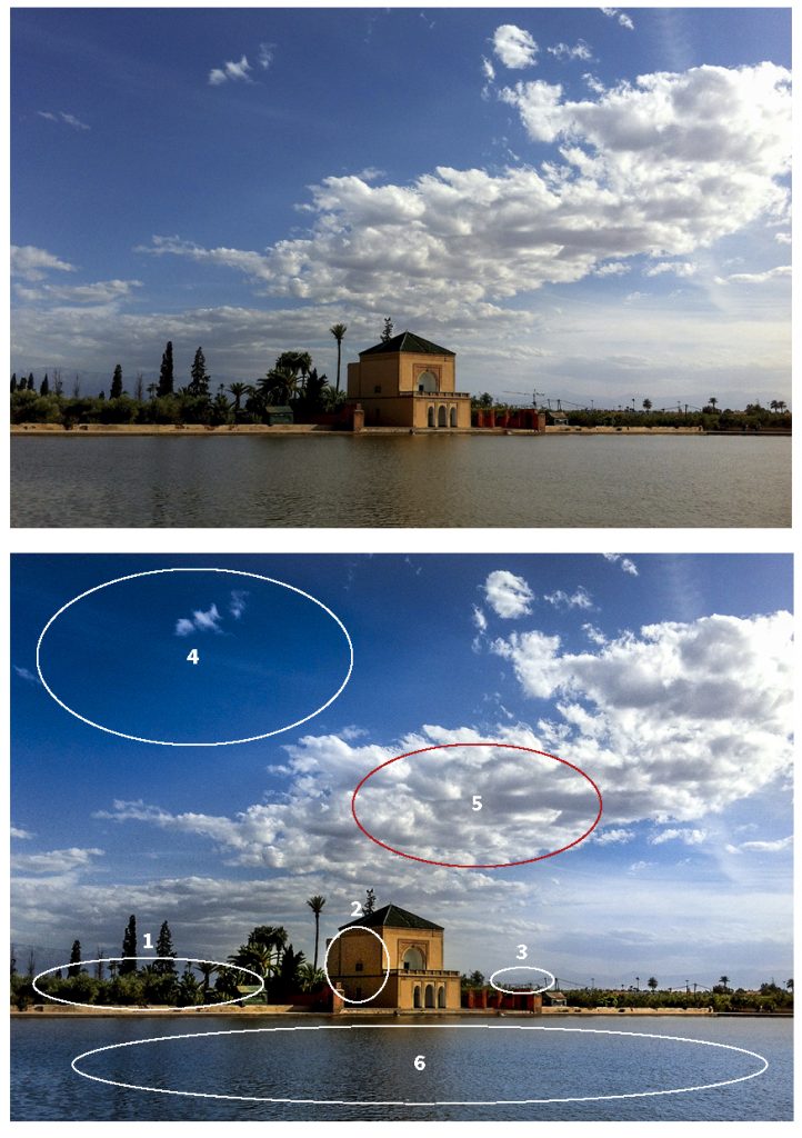
A recent example has been using location pictures from a Royalty Free library. The quality is very mixed due to the content creators being of mixed professional background. Taking some of our high-end scanning and retouching knowledge. A first point can be looking at the details in the horizon line, the point of focus is the edge of the water, so the trees and bushes need to be more defined. The building is rather flat, it is the point of focus of the composition, highlights and mid-tones addressed. The crane on the horizon also lacks the right impression, so removed. Skies evoke so much storytelling, so ensuring an aspirational blue and clouds with contrast and shape, flat of lack-lustre don’t help. Final point, the water needs to reflect the tone of the sky, equally a dirty grey provides no aspiration.

There isn’t a week that goes by, where some of this knowledge is discretely applied to our work. Stuart’s professional development was in this very area; Repro. Ensuring the colour is balanced, points of focus are sharp, retouching is applied to maximise the result. Getting the artwork and imagery right before you print, can really maximise the end result, what goes in, comes out. So why scrimp on your artwork and imaging?

Genuine, Real and Accredited

Over several weeks, it’s become very apparent that smoke and mirrors can rule the roost. In a period where a client working with a third party has been challenged with poor digital materials, knowing what you are working with becomes hard, especially if you want consistency.

A mish-mash of artwork, poor quality PDF’s, differing standards and lack of the right stuff, just leaves a sour taste with all involved.

Anyone can create artwork – Wrong!

It might seem that way, but a seasoned experienced professional, will create artwork which is fit for purpose, ensure reproduction, and be robust. The construction of the elements on a page is critical to sharp good clear reproduction. A good graphic designer or print professional will use Indesign or Quark for page layout. Why? Both these software packages work with the right file formats for important, they have built-in colour management.

My logo is a PNG file – Ouch!

A good print professional/graphic designer will look for a logo to be a vector-based file, which means it will be sharp and reproduce at whatever size. It also allows for a multitude of reproduction methods to be used, from print, garments to signage. Don’t be fooled by the file size. A good quality one can be small when it’s a vector-based file like and .eps .ai .svg .pdf. Equally when we see a .jpg or .png in kb (yes very small size) we know it won’t reproduce with any clarity.

All PDF files are the same – Wrong! 

PDF files can be created for different purposes, and to a technical eye, there are 100s of different specifications, which they can be created to. This varies with how they handle fonts, manage colour, the level they compress images to and many other items. So not all PDF files are artwork. If you need to ask, PDF x1a and PDF x4 are the standards we use.

So, in the same way, you won’t approach a fishmonger to do the conveyancing on your house sale. A good print professional, when handling your project fully, will give you consistent results, artwork which will reproduce sharply and consistently, logos which have clarity, along with PDF’s which print with accuracy. Please note if you require a print specification – ask whoever is doing your artwork, we use a separate setting for proofing oppose to printing.

Point worth noting, printers are not web designers, and likewise, web designers are not printers. Just they both design and make pretty pages doesn’t mean they have the same skill sets.

So commissioning a piece of print, check that whoever is doing your artwork is experienced and knows what they are doing. Check their Linkedin profile, see what clients say about them. As the phrase goes compare Apple with Apples and not Pears.

Boundaries are just imagined

Everyone sets boundaries, sometimes it’s for comfort, others for self-belief. Today has taught me a few things, implementing what you know if highly powerful. To question what you are doing is the very tools of what helps you to stretch the boundaries. I remember a training session I was in 10 years ago which described this as the map is not the territory, suppose today it’s almost a virtual world with infinite horizons.

Without knowledge and education, the wall art I installed this morning, wouldn’t have been as successful as it was. The client was wanting to create something; however, we were well aware their budget wasn’t where it needed to be. So pull out some of the grey matter of Richard Smith’s (Lecturer) History of Art and Design from my ND in Graphic Design at Coventry Technical College enabled a result. Or utilising a “Tromp l’oeil” effect;

Trompe-l’œil is an art technique that uses realistic imagery to create the optical illusion that the depicted objects exist in three dimensions. Forced perspective is a comparable illusion in architecture.

Whilst the business tackles all sorts of projects around Graphic Arts, Printing and stunning visual stuff, we only achieve what we do, for stretching the boundaries (both in the past and now). Let’s face it design is only derived from a designer’s experiences and influences, which shape the result of the individual’s labours. So, is “experience” the new currency?

As the day progressed, an early afternoon video conference call with a business networking connection was scheduled. It was titled up as business cards, which I was keen to understand why, In the current Covid-19 restriction environment we are operating in, the connection was after some. A varied conversation followed, and, learning how and what this lady did within her business, it became apparent, that a different print marketing tool was required, Promo Cards… to provide more flexibility and to unpack her business more. So yet again the boundaries had been set, almost like the inner square of the cricket pitch in this case, when to be able to reach for SIX’es on the boundary is what was required.

We have learnt that over the years, as a printer, and graphic communication professional, it always pays to ask questions, helping our customers to ensure they are getting what they need. I always believe a job done right, results in the customer returning. The only question is, are you wearing blinkers which stop you seeing beyond your boundary?


Our Group Of Companies

Office Print, Business IT, Bespoke Print & Technology Repair Solutions

The HAD-GROUP offers full support for you and your business.

© 2013 - HAD-GROUP.  All rights reserved.